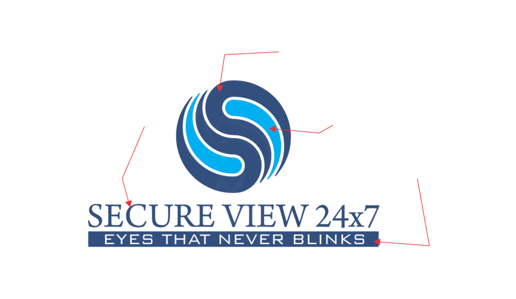
Logo Definition – Secure View 24×7
The Secure View 24×7 logo represents protection, trust, and reliability.
-
Symbol (Circular Emblem):
The circular design with flowing curves suggests continuity, focus, and constant care. The abstract “S” shape reflects the brand name “Secure,” reinforcing identity and purpose. The shades of blue symbolize trust, safety, and dependability, while the circular form conveys wholeness and ongoing support. -
Typography (Secure View 24×7):
The bold and elegant typeface communicates strength, professionalism, and stability. The inclusion of 24×7 highlights the company’s round-the-clock service and commitment. -
Tagline (“Eyes That Never Blinks”):
This phrase emphasizes uninterrupted attention and care, assuring clients that their safety is always a priority.
Overall, the logo blends trust (blue tones), care (eye-like design), and strength (bold lettering) to show that Secure View 24×7 is a dependable partner for constant protection and peace of mind.
